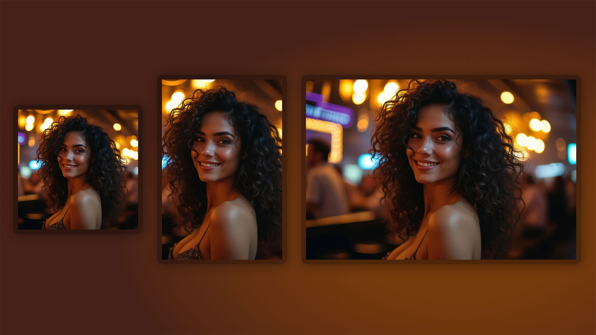
Make Images Look Perfect on Any Screen Size
Categories

In the last few years, front-end developers have been gifted a trio of tools that — when used together — solve one of the oldest, most annoying problems in web design: making images behave. Maintaining layout integrity, avoiding layout shifts, handling responsive screens, art-directioning different crops… you name it.
Enter the powerhouse combination:
- The
<picture>element - CSS
object-fit - CSS
aspect-ratio
Individually, each of these is helpful. Together, they’re unstoppable.
This post breaks down why this combo matters, why devs should absolutely use it, and how the pattern below nails the modern responsive-image workflow.
The Problem They Solve
Images don’t come in tidy ratios. Designers crop things one way, phone screenshots come in another, and clients upload a vertical headshot into a horizontal slot (because of course they do).
Traditionally, solving this required:
- hacky wrappers
- percentage padding “aspect ratio” tricks
- background-image hacks
- JavaScript resizers
- setting fixed heights
- sacrificing performance or flexibility
That’s all outdated now.
1. object-fit Gives You Background-Image Control — on Real <img> Elements
object-fit: cover is basically background-size: cover for real images.
That means:
- No more weird stretching
- The image always fills the box
- The important part stays centered
- Layout stays consistent
Example:
.photo picture img {
  object-fit: cover;
  object-position: center center;
  height: auto;
  width:100%;
}
This transforms a dumb <img> into a smart, flexible, layout-aware element that behaves like a hero image or card thumbnail.
This matters because:
- You retain semantic HTML (a real
<img>with alt text) - You retain lazy-loading,
srcset, browser optimizations - It’s more accessible than
background-image - It’s less CSS, fewer hacks
- It works with the
<picture>element without breaking anything
2. The <picture> Element Adds True Art Direction
Want a landscape crop on desktop?
A tighter portrait crop on mobile?
A WebP for browsers that support it?
JPEG fallback for the ~3 browsers that don’t?
<picture> makes this trivially easy.
<picture>
  <source srcset="img-large.webp" type="image/webp">
  <source srcset="img-large.jpg" type="image/jpeg">
  <img src="img-large.jpg" alt="">
</picture>
Reasons this matters:
- Designers get crop control across breakpoints
- You get better performance through modern formats
- No JS required
- The browser chooses the best file automatically
Together with object-fit, you can crop the same photo differently at different sizes without breaking the layout. That’s real art direction.
3. aspect-ratio Unlocks Layout Stability Without Hacks
This is the secret sauce.
Before aspect-ratio, maintaining consistent image shapes meant padding tricks like:
.image-wrapper::before {
  padding-top: 56.25%;
}
It worked, but it was ugly.
This example:
.photo {
  aspect-ratio: 1 / 1;
}
is not only gorgeous — it’s the right way.
Benefits:
- No FOUC layout shift
- Browser knows size before the image loads → CLS: zero
- No wrapper hacks
- The container is predictable, reusable, flexible
- Works with flexbox, grid, absolutely anything
Combine that with object-fit: cover, and you now have a self-contained, bulletproof image module.
4. The Combo Eliminates 90% of Legacy Responsive-Image Problems
Using <picture> + object-fit + aspect-ratio fixes:
- Inconsistent image sizes
- Stretched uploads
- Mismatched editorial photos
- Layout shifts
- Cropping issues
- Accessibility problems
- Complicated CSS padding hacks
- Need for JavaScript resizing
Plus, it makes your layout future-proof — which matters when CMS clients upload literally anything.
Code Example
It achieves all of this cleanly:
.photo {
  width: 40vw;
  min-width: 300px;
  aspect-ratio: 1 / 1;
}
Aspect-ratio defines the box.
.photo picture img {
  object-fit: cover;
  object-position: center center;
}
Object-fit ensures the image behaves inside the box.
<picture>…</picture>
Picture handles the source logic and art direction.
This is textbook modern responsive design.
Why Devs Should Use This Pattern Everywhere
1. Better UX
- No jarring shifts
- Consistent card grids
- Predictable layouts
- Better cropping
2. Better performance
- Lightweight CSS
- No JS
- Easy WebP/AVIF adoption
- Native browser choice of source
3. More accessible
- real
<img>means realalttext - no decorative-background misuse
4. CMS-friendly
Clients upload wild aspect ratios — this normalizes everything.
5. Future-proof
These features are now fully supported across all modern browsers.
6. Cleaner code
Replacing 25 lines of workaround code with 3 lines feels chef’s kiss.
Final Takeaway
If you’re still relying on:
- Background images for editorial content
- “padding-top: 56.25%” div hacks
- Fixed image heights
- Heavy JS-driven layout scripts
…it’s time to retire all of that.
The trifecta of:
<picture> + object-fit + aspect-ratio
gives you:
- Flexibility
- Control
- Accessibility
- Performance
- Consistent visuals
- Future-proof responsive behavior
This pattern is so good it should be the default way devs handle images in 2025 and beyond.
If you’re not using it yet, you’re doing more work than you need to — and getting worse results.
