Images are a cornerstone of any visually-driven website, especially for escort sites, where aesthetics are paramount. The right image format can dramatically improve page load speed, enhance user experience, and boost SEO rankings.
With the rise of modern formats like WebP and AVIF, website owners now have powerful tools to optimize images without sacrificing quality. However, not all formats are created equal, and understanding their origins, pros, and cons is crucial for creating a high-performing, visually stunning site.
This guide will explore the origins and benefits of modern image formats, how to implement them effectively, and tips for styling images to achieve a professional, responsive design.
Modern Image Formats: Origins, Pros, Cons, and Use Cases
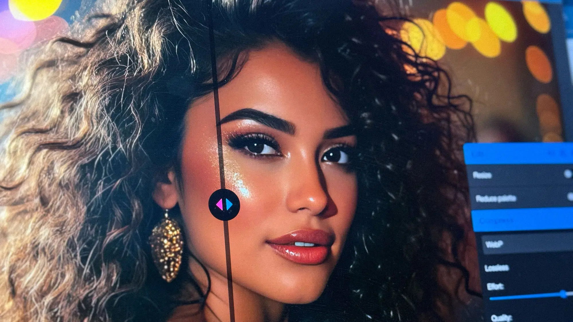
1. WebP
Developed by Google in 2010 as part of its efforts to improve web performance. It is based on the VP8 video codec.
Pros:
- Impressive Compression: Achieves 25-35% smaller file sizes than JPEG with comparable quality.
- Supports Transparency: Like PNG, it offers alpha transparency.
- Animation Capabilities: Can replace GIFs with smaller, higher-quality files.
- Broad Browser Support: Works in most modern browsers, including Chrome, Edge, Firefox, and Safari.
Cons:
- Compatibility Issues: Older browsers, such as Internet Explorer, don’t support WebP.
- Requires Conversion: Images need to be converted from JPEG or PNG.
- Best Use Case: General-purpose web images, such as photos and banners.
2. AVIF
Developed by the Alliance for Open Media (AOMedia) in 2018. It is based on the AV1 video codec.
Pros:
- Jaw-Dropping Compression: Offers up to 50% smaller file sizes than JPEG and 30% smaller than WebP with better visual quality.
- HDR Support: Handles advanced color and brightness ranges beautifully.
- Transparency and Animation: Combines the benefits of PNG, GIF, and WebP.
Cons:
- Limited Browser Support: While growing, it’s still not as widely supported as WebP.
- Resource-Intensive Encoding: Takes more time and computing power to process.
- Best Use Case: Cutting-edge websites that prioritize speed and image quality, particularly for mobile users.
3. HEIC (HEIF)
Developed by Moving Picture Experts Group (MPEG) in 2015. Popularized by Apple, it is the default image format on iOS and macOS devices.
Pros:
- High Quality: Excellent compression with near-lossless results.
- Mobile Ecosystem: Works seamlessly on Apple devices.
Cons:
- Large File Sizes: Too bulky for direct web use.
- Poor Web Support: Limited compatibility outside Apple’s ecosystem.
- Best Use Case: Not recommended for websites; convert HEIC files to WebP or JPEG before uploading.
4. JPEG
Created by the Joint Photographic Experts Group in 1992. It has been a web standard for decades.
Pros:
- Universal Compatibility: Works on all browsers and devices.
- Good Quality: Provides a reasonable balance of quality and file size.
- Easy to Edit: Supported by nearly all editing tools.
Cons:
- Larger File Sizes: Less efficient compression compared to WebP and AVIF.
- No Transparency: Lacks alpha channel support.
- Best Use Case: Fallback format for browsers that don’t support WebP or AVIF.
5. PNG
Developed in 1996 by a group of contributors as an open alternative to the patented GIF format.
Pros:
- Lossless Compression: Retains full image quality.
- Transparency Support: Ideal for logos, icons, and overlays.
Cons:
- Bulky File Sizes: Much larger than JPEG or WebP, making it less ideal for photos.
- Best Use Case: Logos and images requiring transparency.
How to Convert Images for Web Use
Manual Conversion with Squoosh.app
For small-scale conversions, Squoosh.app offers a simple and effective solution:
- Upload your image.
- Choose your desired format (WebP, AVIF, etc.).
- Adjust quality and preview the result.
- Download the optimized image.
Automated Conversion with Plugins for WordPress
For larger libraries, plugins like Imagify, ShortPixel, and Smush simplify the process:
- Convert images automatically during upload.
- Optimize existing images in bulk.
- Generate WebP or AVIF versions while retaining JPEG/PNG fallbacks.
Implementing Modern Formats with the <picture> Element
The <picture> element ensures compatibility by serving modern formats to supported browsers and providing fallbacks for older ones.
Example Code:
<picture>
  <source srcset="image.avif" type="image/avif">
  <source srcset="image.webp" type="image/webp">
  <source srcset="image.jpg" type="image/jpeg">
  <img src="image.jpg" alt="Elegant escort in a blue dress">
</picture>
This setup prioritizes modern formats while ensuring older browsers load JPEGs seamlessly.
Styling Images for Responsive Design
Proper styling ensures images adapt to different screen sizes, particularly for mobile visitors.
Basic Responsive Styling:
img {
  width: 100%;
  height: auto;
}
Using object-fit for Cropped Images:
<div class="picture-container">
  <picture>
    <source srcset="image.avif" type="image/avif">
    <source srcset="image.webp" type="image/webp">
    <img src="image.jpg" alt="Elegant escort in a blue dress">
  </picture>
</div>
CSS:
.picture-container {
  position: relative;
  width: 100%;
  height: 400px;
  overflow: hidden;
}

.picture-container img {
  width: 100%;
  height: 100%;
  object-fit: cover;
  object-position: center;
}
Conclusion
Modern image formats like WebP (Google) and AVIF (AOMedia) offer revolutionary compression and quality, making them indispensable for high-performing escort websites. While browser support isn’t yet universal, providing JPEG or PNG fallbacks ensures compatibility. By leveraging tools like Squoosh or Imagify, implementing the <picture> element, and styling images thoughtfully, you can create a fast, visually stunning site that leaves a lasting impression on visitors.