Site Launch: Nina Skye
Categories
I’m thrilled to announce the launch of Nina Skye’s official website!
Nina is a sex worker at the World Famous Chicken Ranch in Pahrump, Nevada, and when she approached me, she had one clear goal in mind: she wanted to stand out. While the bio on the Chicken Ranch website gives a glimpse of who she is, Nina wanted a space where her personality, creativity, and story could shine. She envisioned a sleek, clean, sexy, and modern design that would truly feel like her own.

Bringing Her World to Life
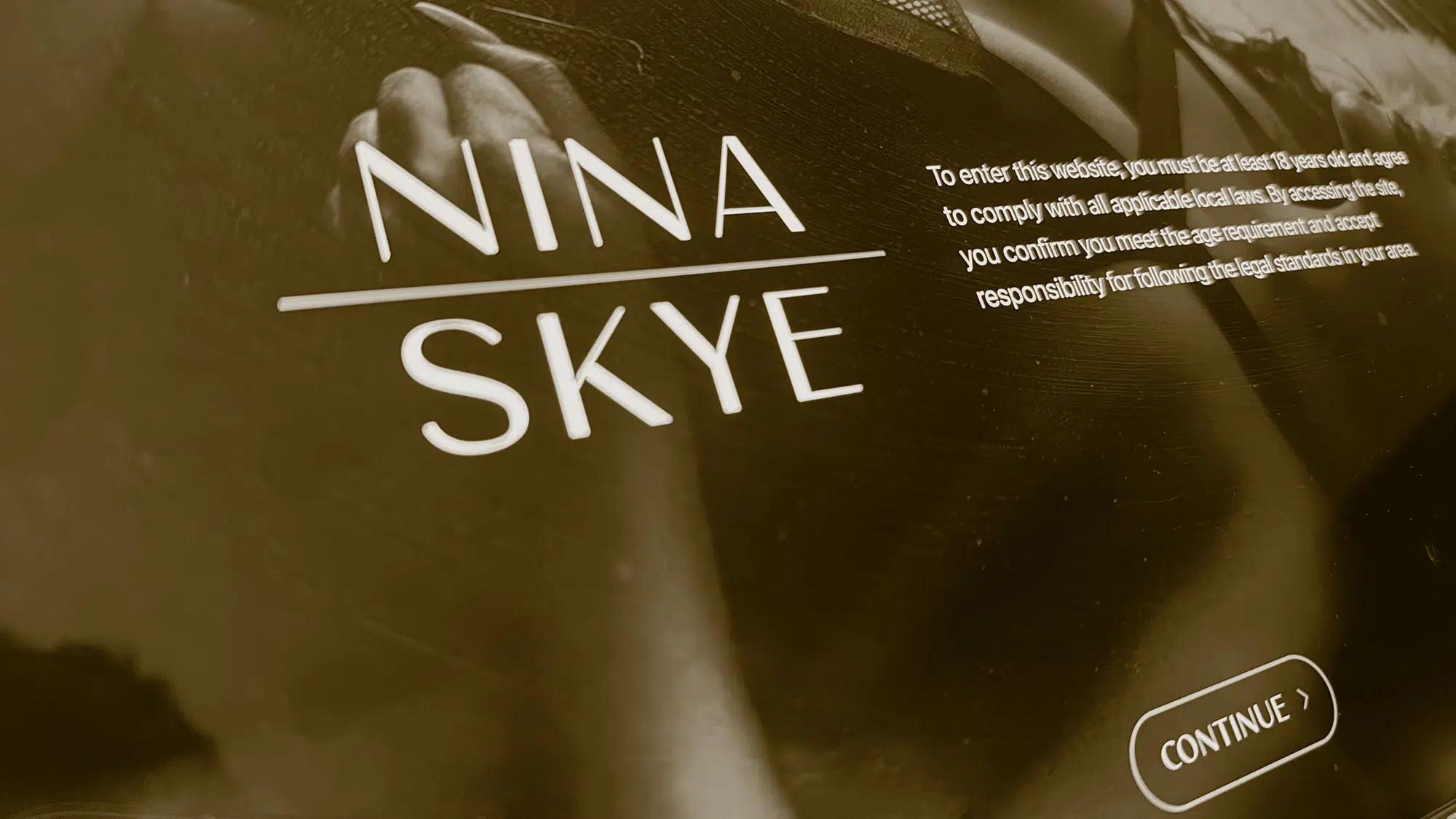
One of the most exciting aspects of this project was Nina’s photography. Her photos often feature warm gold hues, which became a major inspiration for the site’s color palette. Gold isn’t just a rich and inviting color; it perfectly complements the allure and sophistication Nina exudes. Pairing these tones with clean typography and modern layouts created a visual experience that feels high-end and personal.


To give her brand a unique touch, I created a simple but elegant logo using one of my all-time favorite fonts, Carla Sans. Its clean and contemporary lines tied seamlessly into the site’s aesthetic, offering a refined but approachable look.

Design Highlights
1. Fixed Side Navigation for Desktop
I’ve always been a fan of fixed side-navigation for desktop experiences, and Nina’s site was the perfect opportunity to use it. Not only does it look sharp, but it also ensures users can easily access key sections no matter where they are on the page. It’s practical, elegant, and undeniably user-friendly.

2. A Fun, Conversational FAQ
One of my favorite parts of this site is the FAQ section. Instead of a typical list of questions, we designed it to feel like a text conversation. It’s a fun way to capture attention and invite users to learn more about Nina in a relaxed and engaging way.

3. Scrolling Animations That Feel Sexy and Smooth
To elevate the browsing experience, we incorporated subtle scrolling animations. From fade-ins to sliding transitions, every movement feels intentional, fluid, and just a little sexy—an extension of Nina’s brand.
Streamlined and Whimsical: The “Experience” and “Invest” Sections
We knew the “Experience” and “Invest” sections would be crucial. These areas needed to provide clear, actionable information while still feeling inviting and easy to navigate. By keeping the design simple and the content concise, we avoided overwhelming the user. At the same time, we added subtle design details—like whimsical animations and hover effects—to keep things interesting.

The Newsletter Signup
If I had to pick a favorite feature, it’s hands-down the newsletter signup form. This isn’t your average “enter your email here” box. Using GSAP’s Flip functionality, we created an interactive and visually stunning element that transforms as users interact with it.
For those unfamiliar, GSAP’s Flip (which stands for First, Last, Invert, Play) makes it incredibly easy to animate between two states of an element. For example, the newsletter signup starts as a simple button, but when clicked, it expands into a beautifully styled form with a smooth, cinematic transition. Flip calculates the difference between the initial and final states, handling everything from scaling to positioning, so the animation feels effortless and polished. It’s modern web design magic, and I loved implementing it here.
Nina Skye: A Website as Unique as She Is
From the bold gold accents to the conversational FAQ, this site was all about helping Nina stand out in her industry. Every detail—from the sleek design to the playful touches—reflects her personality and style, offering a glimpse into her world beyond the bio.
Whether visitors are exploring her photography, learning about her services, or just enjoying the little moments of whimsy throughout the site, the goal was to create an experience that feels as captivating as Nina herself.
This project was a joy to bring to life, and I’m so proud of how it turned out. If you’re looking for a site that’s as bold, beautiful, and unforgettable as Nina Skye, you know where to find me. 😉