If you’ve ever looked at a messy stylesheet full of class names like red-button2 or footer-link123, you know how challenging it can be to understand and maintain a project. That’s where BEM comes to the rescue!
BEM stands for Block, Element, and Modifier—a methodology that promotes clear and consistent naming conventions in your CSS. By using BEM, you can write CSS that is not only easy to read but also scalable and maintainable.
Let’s dive into what BEM is, why it’s so beneficial, and how it can be applied—even to projects like an escort site, where clarity and elegance are crucial.
Understanding the Basics of BEM
1. Block
The block is the standalone entity that represents a component on your site. Think of blocks as reusable pieces of your design, like a navigation bar, a card, or a button. Blocks are self-contained and don’t depend on anything else.
Examples:
menucardbutton
2. Element
The element is a part of the block that performs a specific function. Elements are always tied to a block and cannot exist on their own. They’re separated from the block name with two underscores (__).
Examples:
menu__itemcard__titlebutton__icon
3. Modifier
Modifiers are used to represent a variant or a state of a block or an element. They’re separated by two hyphens (--) and indicate differences like size, theme, or behavior.
Examples:
menu--horizontalcard__title--largebutton--disabled
Why Should You Consider BEM?
- Clarity: The relationship between your CSS classes and your HTML structure is clear.
- Scalability: Large projects can grow without turning your CSS into a tangled mess.
- Consistency: Teams working on the same project follow a uniform convention.
- Maintainability: You can make changes without fear of unintended consequences elsewhere.
Standard Naming vs. BEM
Let’s compare standard class naming with BEM to see the difference.
Standard Naming:
<div class="card">
  <h2 class="card-title">Title</h2>
  <p class="card-text">Description</p>
  <a class="card-link red" href="#">Read More</a>
</div>
CSS:
.card-title {
  font-size: 1.5rem;
}

.card-text {
  color: gray;
}

.card-link.red {
  color: red;
}
Problems:
- The
redclass is ambiguous. What if another element also usesred? - The
card-linkandcard-titleclasses don’t indicate their connection to.card.
BEM Approach:
<div class="card">
  <h2 class="card__title">Title</h2>
  <p class="card__text">Description</p>
  <a class="card__link card__link--red" href="#">Read More</a>
</div>
CSS:
.card__title {
  font-size: 1.5rem;
}

.card__text {
  color: gray;
}

.card__link--red {
  color: red;
}
With BEM:
- The
card__link--redmodifier clearly indicates that it’s a variant ofcard__link. - Every class has a clear purpose and relationship.
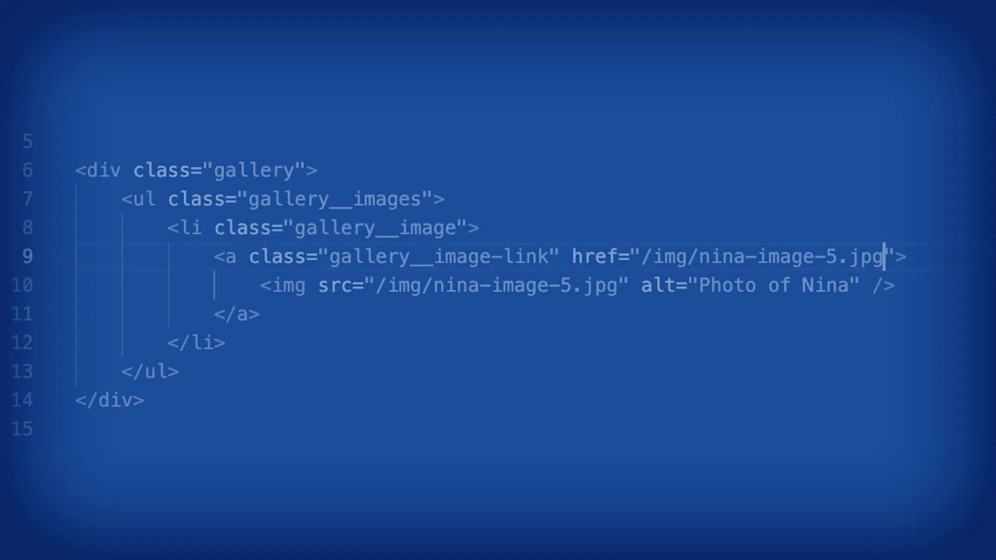
Examples for an Escort Site
Example 1: Profile Cards
<div class="friend">
  <img class="friend__image" src="sophia-1.jpg" alt="Photo of Sophia by a window in black lingerie">
  <h2 class="friend__name">Sophia</h2>
  <p class="friend__description">Elegant, witty, and available for duos and dinner dates.</p>
  <a class="friend__contact friend__contact--primary" href="/friend/sophia">Book Now</a>
</div>
CSS:
.friend__image {
  width: 100%;
  border-radius: 8px;
}

.friend__contact--primary {
  background-color: #ff4081;
  color: #fff;
  padding: 0.5rem 1rem;
}
Example 2: Service List
<ul class="service-list">
  <li class="service-list__item service-list__item--highlighted">Dinner Dates</li>
  <li class="service-list__item">Weekend Getaways</li>
  <li class="service-list__item">VIP Events</li>
  <li class="service-list__item"><abbr title="Fly Me To You">FMTY</abbr></li>
</ul>
CSS:
.service-list__item {
  font-size: 1rem;
  padding: 0.5rem;
}

.service-list__item--highlighted {
  font-weight: bold;
  background-color: #f4f4f4;
}
Example 3: Navigation Menu
<nav class="navigation">
  <ul class="navigation__list">
    <li class="navigation__item navigation__item--active"><a href="#">Home</a></li>
    <li class="navigation__item"><a href="#">About</a></li>
    <li class="navigation__item"><a href="#">Services</a></li>
    <li class="navigation__item"><a href="#">Contact</a></li>
  </ul>
</nav>
CSS:
.navigation__item--active a {
  font-weight: bold;
  color: #ff4081;
}
The Elegance of BEM
By using BEM, you can see how the class names immediately explain their role:
friend__imageis the image inside the friend card.service-list__item--highlightedis a specific state of a list item.
No guesswork. No conflicts. Just clarity.
Conclusion
BEM is more than just a naming convention—it’s a philosophy for writing better, more maintainable CSS. By adopting BEM, you ensure your projects are clean, readable, and scalable, no matter the complexity. Whether you’re building a small business site or an elegant escort platform, BEM empowers you to create designs that are as easy to maintain as they are visually appealing.
Time to say goodbye to messy class names and embrace the elegance of BEM!