A Familiar Face, Reframed
Categories

Some websites mark the beginning of a creative relationship. Others give you the rare opportunity to return years later and see just how far both the client and the work have evolved.
I first created Vivienne Lawrence’s website more than ten years ago. Since then, her brand has grown alongside her – as an entrepreneur, artist, writer and woman. The original site had served her well, but after more than a decade, it was time to create something richer, more mature and more reflective of the person she is today.
The new VivienneLawrence.cc is more than a redesign. It is a reintroduction: romantic, editorial, confident and distinctly Vivienne.
Setting the mood from the first frame
The experience begins with a cinematic landing page built around one commanding image.
Rather than crowding the screen with navigation or introductory copy, the page lets the photography establish the atmosphere. The script logo sits delicately in the corner while the oversized serif statement – “Your Passionate MILF” – becomes part of the composition.
Soft focus, warm light and deep auburn tones give the page an almost filmic quality. It doesn’t explain everything immediately. It creates curiosity and invites the visitor to enter.
A sidebar with presence
Once inside, the site is anchored by a persistent sidebar navigation.

The sidebar is not simply a place to feature the site navigation. It is a major part of the visual identity. A tone-on-tone damask pattern gives it the richness of vintage wallpaper, while the script logo reinforces Vivienne’s personal signature.
Fine gold rules separate each section, and the active page is highlighted with a softly rounded shape that subtly interrupts the pattern. The treatment makes moving through the site feel considered and tactile—more like exploring the rooms of a private space than clicking through a conventional website.
Oxblood, auburn and antique gold
The color palette takes its cues from Vivienne herself: her red hair, her warmth and her love of vintage glamour.
Deep oxblood and burgundy form the foundation, gradually shifting into warmer auburn and burnished red. Antique gold is used for borders, typography and small interface details, while cream softens the body copy and provides contrast.
The result is sensual without being predictable. It feels romantic and luxurious, but also grounded, intimate and lived-in.

Photography as the main attraction
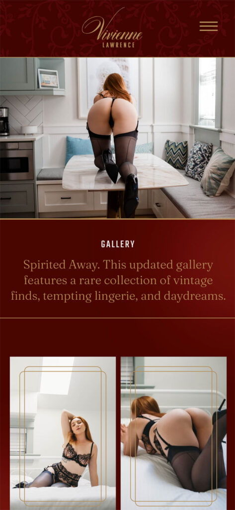
Vivienne’s photography is not treated as decoration added after the design. Large images are allowed to command entire sections, while others are paired with editorial blocks of copy. Thin, rounded gold borders overlap the edges of the photography, giving each image the feeling of a framed print while also connecting it to the surrounding interface.
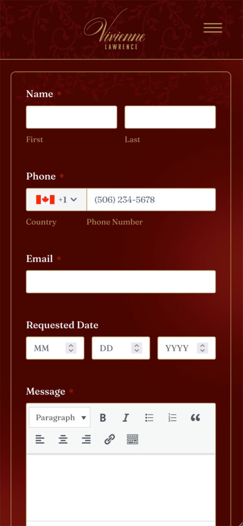
The borders repeat across photographs, content panels, statistics and accordions. That consistency gives the site structure without introducing heavy boxes or rigid dividers.



A different take on personal statistics
Personal statistics are expected on a companion website, but they are often presented as a basic list or table. I wanted Vivienne’s details to feel more intentional.
Instead, the information is arranged as a collection of modular cards. Short details such as age, height and shoe size occupy smaller spaces, while more expressive information – her background, body type, languages and personal preferences – is given room to breathe.
The different card sizes create an editorial rhythm and turn what could have been a clinical specification sheet into a more complete portrait of Vivienne. Visitors can still find the information quickly, but the presentation feels personal and designed.
Details that invite interaction
The FAQ continues the visual language with oversized accordion panels outlined in antique gold. Questions are set in an elegant italic serif, while minimal plus signs encourage interaction without introducing unnecessary visual clutter.
These elements are functional, but they still belong completely to Vivienne’s world. Nothing feels like a generic component dropped into the design.
More than ten years later
The most rewarding part of a long creative relationship is having the opportunity to revisit the work with years of shared history behind it.
This redesign doesn’t erase the identity we created more than a decade ago. It builds upon it – retaining Vivienne’s warmth, sensuality and individuality while giving the brand a more sophisticated visual language and a much stronger digital experience.
More than ten years after launching her original website, I’m proud to introduce the new VivienneLawrence.cc.
A familiar face, beautifully reframed.