
Every once in a while, CSS gets something that makes you look back at the way we used to build websites and wonder what the hell we were doing.
aspect-ratio is one of those things.
I’ve been building websites long enough to remember when making an image responsive could turn into an entire afternoon. And logos? Jesus.
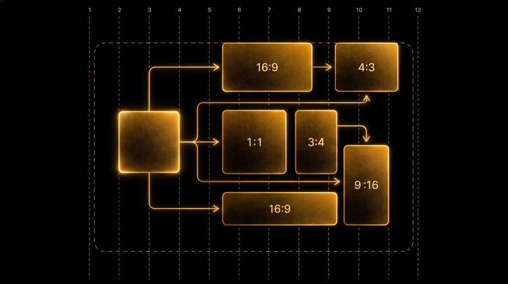
You’d get a logo that’s 1,200 × 300. Another that’s 640 × 640. Another is 2,400 pixels wide with 400 pixels of mysterious transparent space around it because apparently whoever exported it wanted to hurt you personally. Then the request comes in:
“Can you make all the logos the same size?”
Sure. What does same size mean?
Same width? Same height? Same visual weight? Same bounding box? What happens when the screen gets smaller? What happens when one logo is basically a square and another is shaped like a fucking runway? And thus began the CSS gymnastics.
.branding {
  max-width: 200px;
  max-height: 80px;
  width: auto;
  height: auto;
}
Then you realize that doesn’t quite do what you want. So you add a wrapper. Then another constraint. Then object-fit. Then a media query. Then you change one thing and discover Safari has decided it would like to participate in the conversation. All because you wanted an image to keep its damn shape.
And Then CSS Gave Us aspect-ratio
This still feels almost suspiciously simple:
.image {
  width: 100%;
  aspect-ratio: 16 / 9;
}
That’s it. You give CSS one dimension and the shape. CSS figures out the other dimension. Want something 300 pixels wide and 16:9?
width: 18.75rem;
aspect-ratio: 16 / 9;
CSS knows the height.
Want something 80 pixels tall and 4:1?
height: 5rem;
aspect-ratio: 4 / 1;
CSS knows the width. Why the hell were we doing all that other stuff?
This Is Where Responsive Design Gets Really Good
The real magic isn’t just maintaining the shape of an image. It’s that you can stop thinking about two dimensions. That sounds like a tiny thing. It isn’t. Responsive design has traditionally involved constantly negotiating width and height. How wide should this be?
Okay, then how tall should it be?
What happens at 1200px? What happens at 768px? What happens at 375px? Do I need another breakpoint?
With aspect-ratio, you can often throw half of that thinking away.
.featured-image {
  width: clamp(20rem, 80vw, 90rem);
  aspect-ratio: 16 / 9;
}
Read what that CSS is actually saying: Be responsive. Don’t get too small. Don’t get too big. And whatever happens, stay 16:9.
Two lines. That’s an enormous amount of layout intelligence for two lines of CSS.
Logos Are Where I Really Love This
Logos have always been one of those deceptively annoying little pieces of web design. A logo has an intrinsic shape. That’s part of the design. So why should I be calculating both dimensions every time I use it? If my logo is 4:1:
.branding {
  width: clamp(8rem, 15vw, 16rem);
  aspect-ratio: 4 / 1;
}
Done. I only care about how wide I want it. Or maybe I’m designing a navigation bar and the height is what matters:
.branding {
  height: clamp(2rem, 4vw, 4rem);
  aspect-ratio: 4 / 1;
}
Done again. I don’t need another clamp() for the width. I don’t need to calculate anything. I don’t need to keep two responsive values synchronized. Width or height. Pick one. The ratio handles the rest. That is such a wonderfully simple way to think about responsive assets.
Remember the Percentage Padding Hack?
Anyone who has been doing this for a while probably remembers this beauty:
.video-wrapper {
  position: relative;
  padding-bottom: 56.25%;
  height: 0;
}
Why 56.25%? Because 9 ÷ 16 = .5625. So naturally the completely reasonable way to make a responsive video was to turn web developers into part-time geometry teachers. Then we’d absolutely position the iframe inside it.
.video-wrapper iframe {
  position: absolute;
  inset: 0;
  width: 100%;
  height: 100%;
}
We did this. For years. Now?
iframe {
  width: 100%;
  aspect-ratio: 16 / 9;
}
Come on. That’s not an improvement. That’s CSS apologizing.
It Makes Layouts More Stable Too
There’s another really useful benefit that isn’t quite as sexy. If the browser knows the width and the aspect ratio of something, it already knows how much space that thing needs.
That’s especially useful for media. Instead of waiting for an image or video to load and then discovering how tall it is, the browser can reserve the space ahead of time. That means fewer weird layout jumps and fewer moments where you’re about to click something and the entire page suddenly moves because an image finished loading.
Again: we’re not really telling the browser exactly what to do. We’re giving it enough information to figure things out. And that’s where modern CSS is getting really interesting.
Modern CSS Is Basically: Stop Micromanaging the Browser
This is the larger thing I love about aspect-ratio. It fits into what I think is the best evolution happening in CSS. We’re slowly moving away from:
At this screen size, make this exactly 742 pixels wide.
And toward:
Here are the rules. You figure it out.
clamp() gives the browser boundaries. Grid gives it relationships. Flexbox gives it distribution rules. Container queries give components awareness of their available space.
And aspect-ratio says:
Whatever size this becomes, keep this relationship intact.
That’s a much smarter way to build for a web where screens can be 320 pixels wide or 5,120 pixels wide and everything in between. The browser is actually really fucking good at layout. Maybe we should let it do some.
One Dimension. That’s the Whole Point.
That’s what makes aspect-ratio so useful to me. It takes a two-dimensional problem and, in a lot of cases, turns it into a one-dimensional one. You know the shape. So you only need to decide the width:
width: 100%;
aspect-ratio: 16 / 9;
Or the height:
height: 4rem;
aspect-ratio: 3 / 1;
That’s it. The browser knows math. Let it do math.
After decades of writing CSS, some of my favorite new features aren’t the ones that let us create crazy new things. They’re the ones that make me delete 15 lines of code and wonder why the hell I ever had to write them in the first place.
aspect-ratio is absolutely one of those.